
Since you are focusing on a new web application, these remarkable Bootstrap dashboard examples and templates will be extremely helpful.
You’re in luck. Why, you may ask. Because you don’t need to go through the process of settling for a reliable alternative.
We spent weeks reviewing dozens of possible candidates for this list but picked the ultimate 10.
We based our selection on the design, responsiveness, available components and customization options.
All the dashboard examples below are packed with features. On top of that, they are effortless to use and modify.
CMS, CRM, SaaS, website, analytics, user management – IT ALL WORKS for these!
Make it happen quickly and comfortably with a ready-to-use template now.
Here’s the thing: even though we put our favorite at the top, all these templates are powerful and amazing. In other words, you’ll make the right decision no matter which you pick.
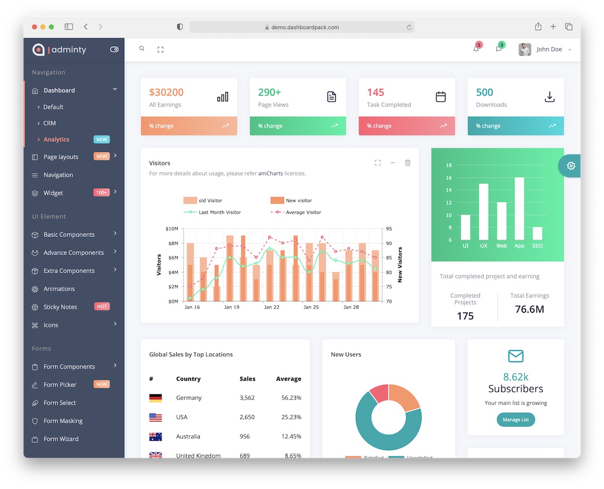
But we need to start somewhere – with Adminty!
With a modern and clean design, all the data you plan to monitor will appear amazingly. Adminty comes with quite some styling options, so you may not need to do any coding to beautify it.
What’s cool is that you can test the live customizer on the demo page, checking the different layouts and over two hundred components.
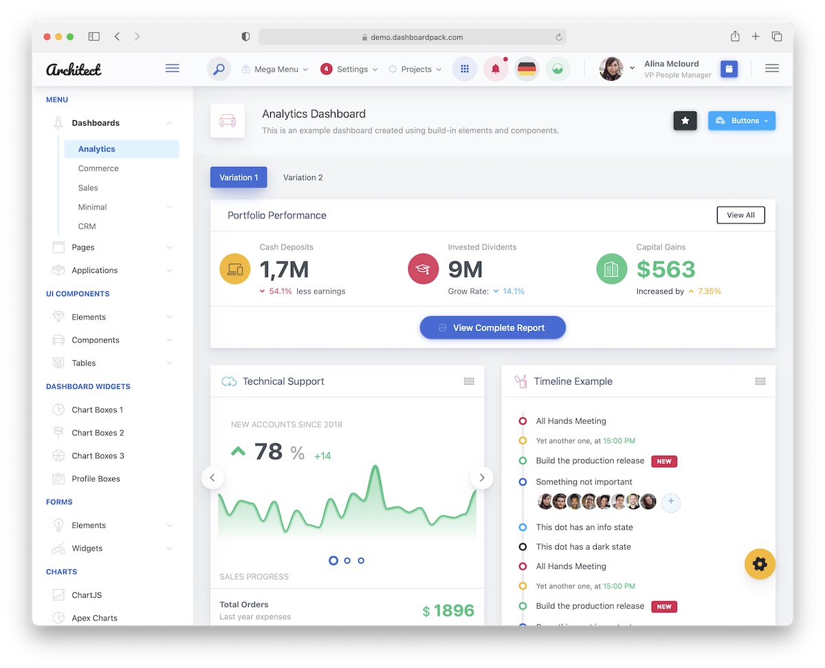
If you need a versatile Bootstrap dashboard template because you work on multiple web projects, ArchitectUI is easily the best solution.
Just the default setting comes with nine different dashboards. But you can easily exceed that by doing customizations and improvements. Which, by the way, will be an easy task!
You can easily adjust ArchitectUI to your needs and regulations. Building a professional and flexible admin doesn’t need to take a whole lot of time.
Note that you get over 250 components and widgets that can be mixed and matched however you want. ArchitectUI also comes with regular updates and support.
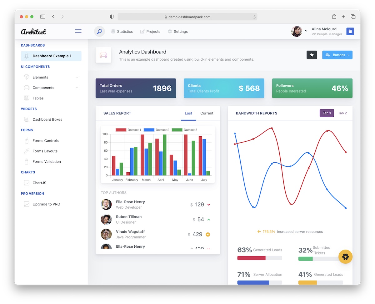
What’s cool, ArchitectUI also comes as a free Bootstrap dashboard template. If you don’t want to go all-in just yet, this is a great start to your development process.
You have many more limitations, but you’ll still enjoy ArchitectUI’s greatness. It uses only the latest technologies, promises great performance, and guarantees easy edits.
Some styling options from the premium version are available here, too. Multiple color skins, optional fixed elements and more.
You can even contact the author with any questions and concerns. (Which is not very common for a free template! Salute, DP.)
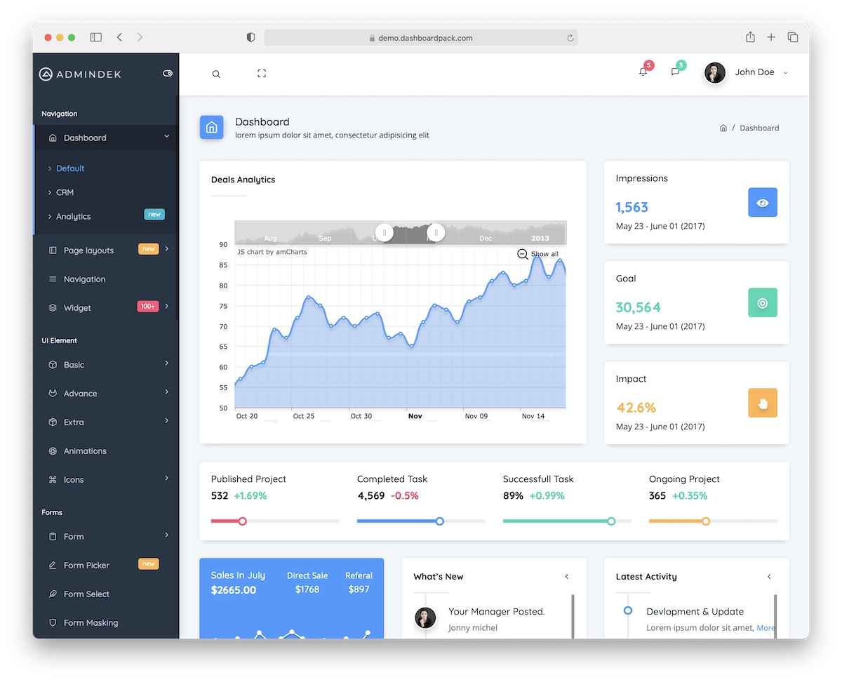
Admindek is an admin dashboard template based on Bootstrap Framework that screams cleanness. And that’s exactly what you need to build a dashboard for any web application.
You do not want too many distractions that may make reviewing data complicated.
Admindek is well aware of that. It does things correctly with many predefined layouts you can use at your discretion.
You can choose from three pricing options, starting with the personal license at $69. Your option depends on how many projects you’d like to use Admindek for and how many developers you’d like to work with.
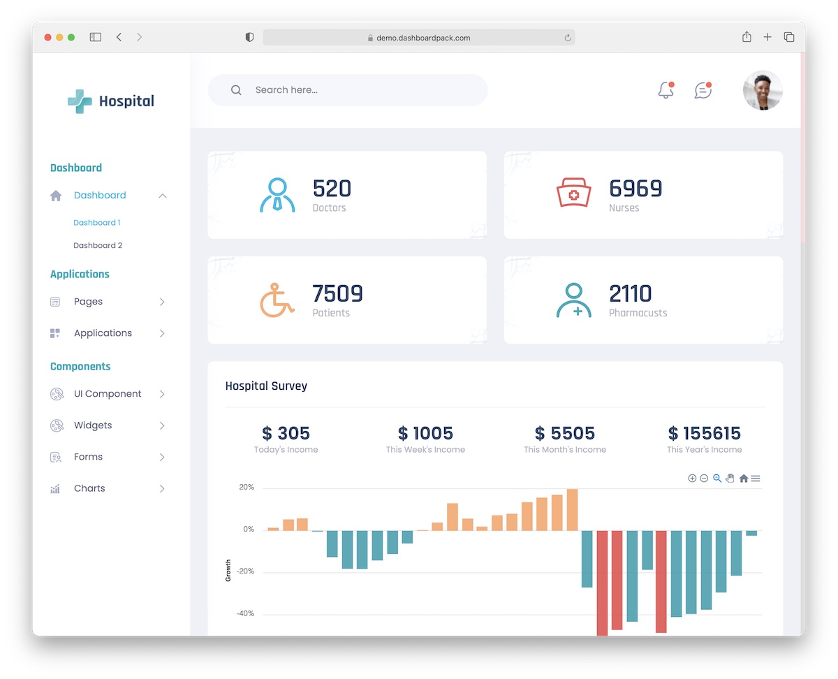
Even though these Bootstrap dashboard examples are for many projects, we still have some more industry-specific.
Hospital, you know what this one is all about. Hospitals, clinics, and other medical institutions can greatly profit from this minimalist template.
The bundle includes modern technologies, hundreds of elements, easy modifying, and two dashboard styles. You can comfortably preview Hospital on different devices if you want.
We like the simplistic, almost basic approach to its appearance. Doctors, nurses, surveys, activities, anything and everything you plan to track will come in view with crystal clarity.
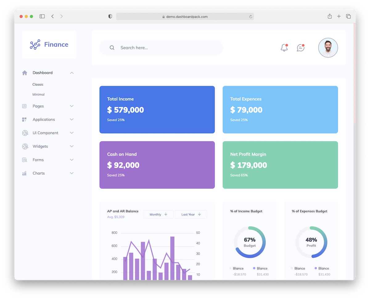
With Finance, you can now sort out all your financial data like a champ. This Bootstrap dashboard template does things the modern way.
The stunning design displays everything beautifully. It also smoothly reshapes itself to different screen sizes, keeping the amazing performance intact.
Finance is also lightweight to ensure great loading speeds. And the code is well-organized, so users of all skill levels can benefit greatly. Read: get the most out of Finance.
There are many possible color and design variations (by default!), scalable assets, and 200+ editable components—what else do you need?
Create a leading dashboard speedily with Finance. You’ll love it.
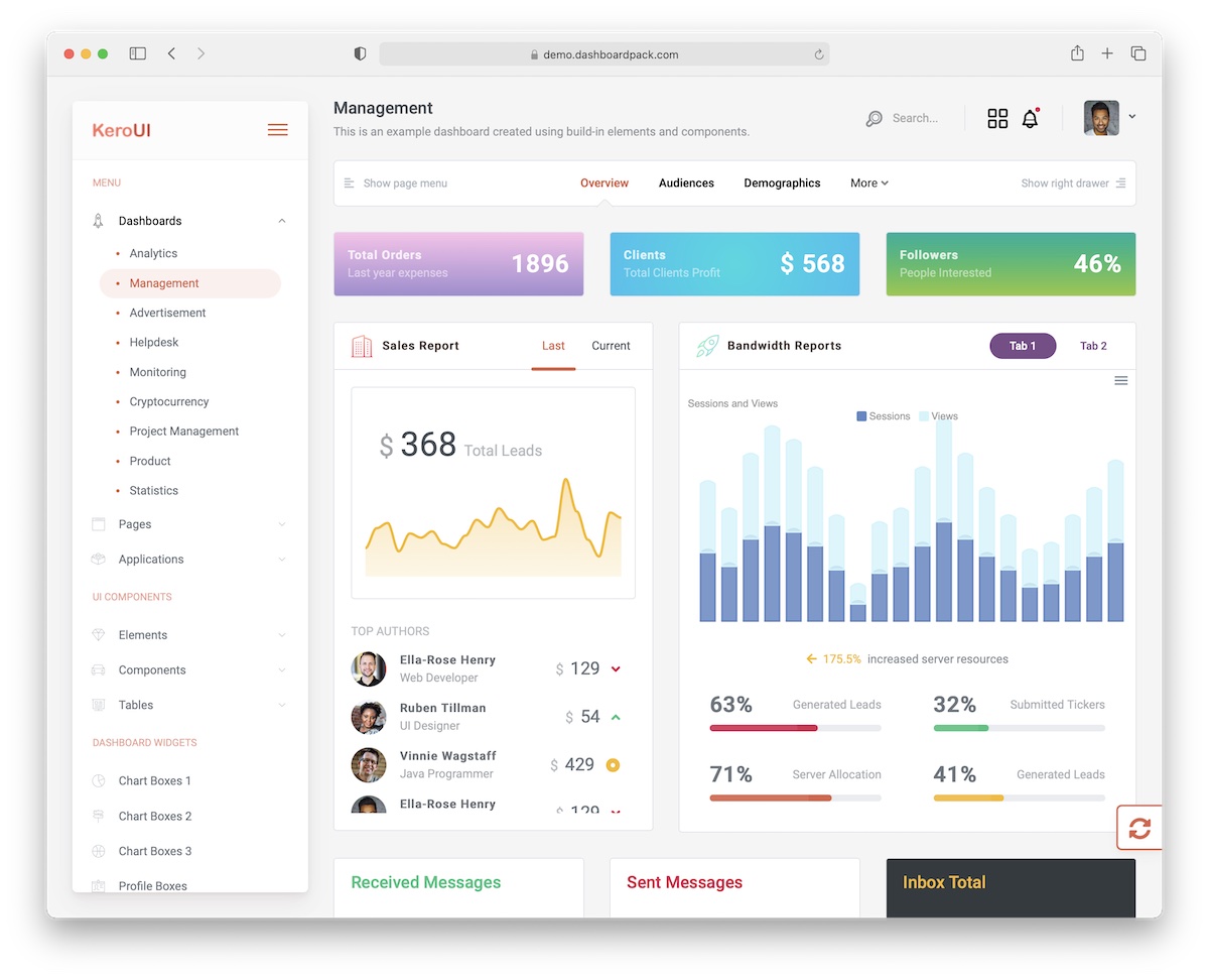
Kero is an all-around template based on Bootstrap with nine different dashboard layouts. If you prefer the more traditional vertical layout, you can opt for the horizontal layout right from the start.
I’m sure you’ll notice differences between ArchitectUI and Kero. But that’s a good thing. Both are extraordinary solutions that boost your workflow beyond measure.
Kero uses Gulp and Bootstrap 4, guaranteeing fast loading and a fantastic user experience. You can join the community forum, contact the support team, or review extensive documentation for additional assistance.
Kero makes sure you win.
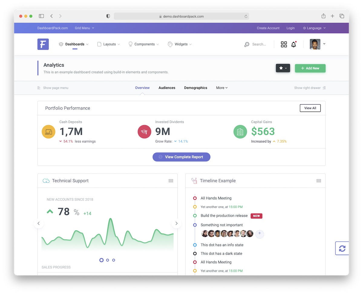
While Kero has horizontal and vertical layouts, Fiori specializes in the former. This Bootstrap dashboard example is multi-purpose, as you can use it for numerous web projects you work on.
But there’s a catch. If you are working on multiple applications, you must opt for at least the middle license/pricing option, which is $149.
This one also gives you one year of free support and updates. You can comfortably work on personal and commercial projects and let other developers join you to make great things happen together.
Horizontal admins and dashboards – check!
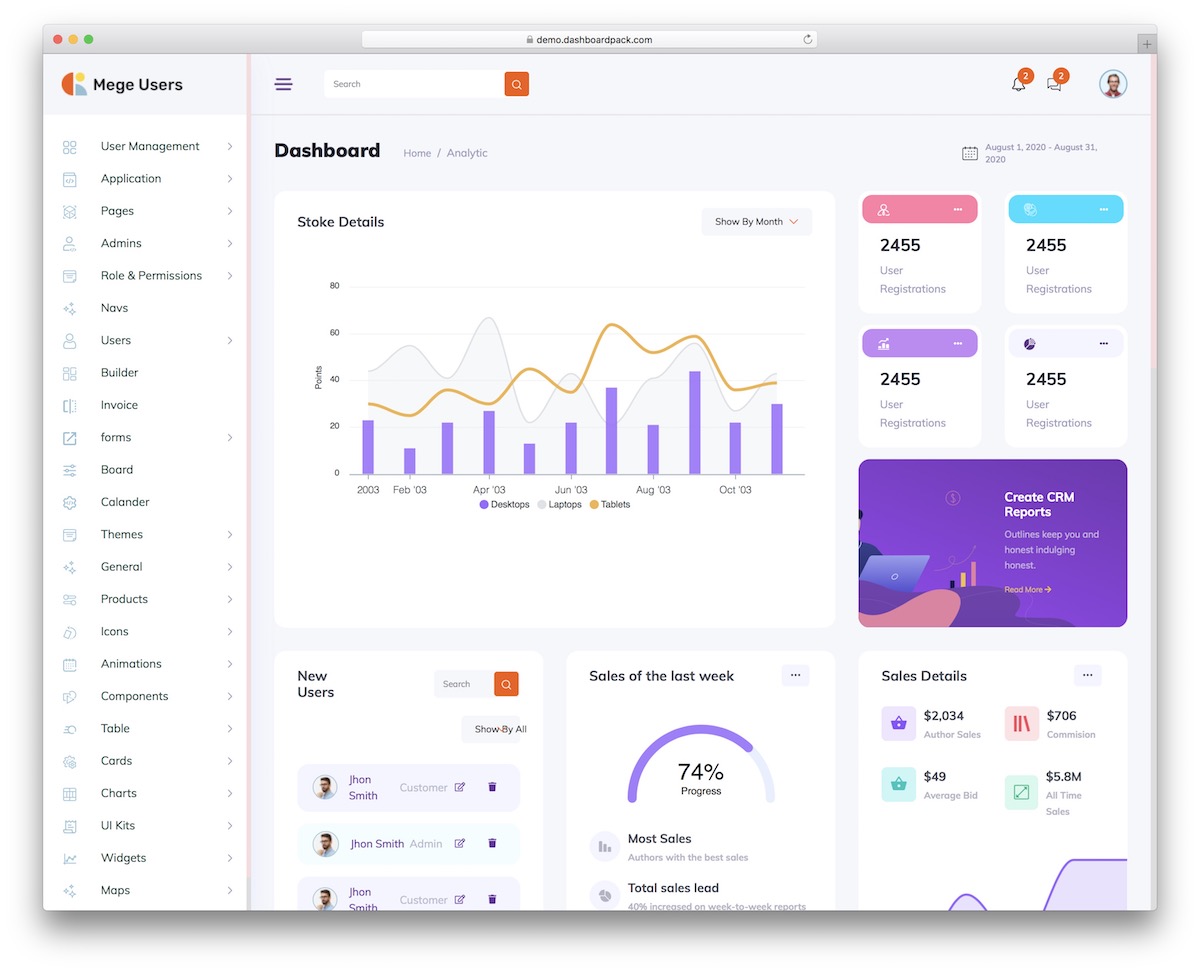
These days, you can save yourself a ton of time and work with the right tools. Managing users and having a complete overview of web projects becomes a piece of cake with User Management.
This stunning Bootstrap dashboard example doesn’t shy away from your ideas. After all, if it doesn’t work exclusively out of the box for your purpose, you’re welcome to tweak it.
All the work you plan to do with User Management will be easier. Modern technologies, clean code, predefined elements, layouts, and styles are all there to make your life more comfortable.
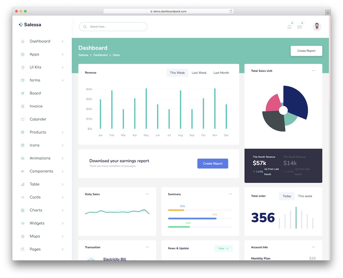
Sales is a Bootstrap template that’s in the same space as Finance. But if you need more design alternatives, this one will surely spark your interest.
First, Sales’s design is very clean, so all the content appears distraction-free.
Second, you get multiple dashboards and other practical page layouts. Each is also 100% configurable to your needs.
Third, every user has access to over two hundred customizable elements. You can use and reuse them however you like!
And fourth, the friendly and professional support and comprehensive documentation will never make you feel lonely.
Sales is great for beginners and excellent for professionals. Everyone can take it to their total advantage.
Comments (No Comments)